Data-driven decision making is integral for any organization. However, just because you have the data, doesn’t mean you’re able to make sense of it and draw useful insights. That’s where data visualization comes in. When you implement good data visualization techniques on your analytics dashboards, you effectively communicate the meaning of your data to your business users. Data visualization allows you to take raw, disorganized data points and present them in a way that enables better decision making.
Believe What You See When You See It
Just as anything in life, depending on which angle you’re looking at something, the story you tell will change. The same is true with data. The narrative is completely dependent on what you see and when you see it, which is why data visualization is key to better decision-making.
Data on its own and in its raw format cannot easily show relationships, correlations, and patterns. In 1973, statistician Francis Anscombe constructed “Anscombe’s Quartet” to demonstrate the importance of graphic data to support statistical analysis.
Data visualization is graphical representation of information, often self-service, that allows business users to easily understand data trends, outliers, and patterns. The right data visualizations can allow even the most novice of end users to consume and understand the most important information needed to achieve objectives and make data-driven decisions.
With modern analytics tools in place, the same data can be leveraged to tell different stories, which is especially important when you have users with different needs. However, just because you have the technology in place, there are still so many ways to design a dashboard, making it difficult to decipher how to do so in order to glean the insights you need.
Here are six tips from our experts on how to create data visualizations that provide the most value to your organization:
Step 1: Understand Context
Knowing your audience and their data needs is key to creating powerful data visualizations. Understand that this will vary from business functions and users and that it can change over time.
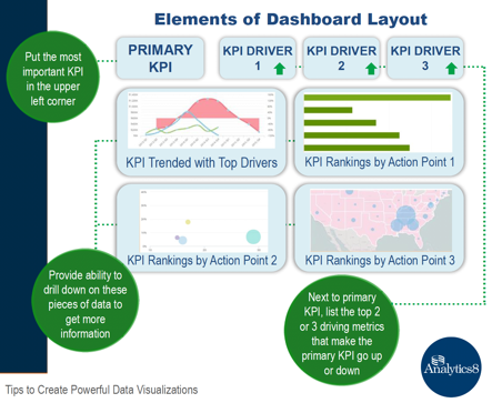
Step 2: Ensure the Dashboard Layout Emphasizes Your Primary KPI
By now, we’ve all learned that simplicity leads to ease—at least this is true when it comes to understanding complex information, such as data. The layout of your dashboard should facilitate a natural flow to help users consume the information you are providing.
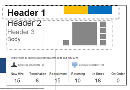
Step 3: Follow Simple Design Techniques
Just as important as layout is design. A well- designed dashboard highlights what’s important and promotes intuitive understanding. When design lacks thoughtful hierarchy, the user won’t know where to start.
Step 4: Declutter
The KonMari Method coined by Marie Kondo encourages keeping only those things that speak to the heart and discarding items that no longer spark joy. You can apply this same method to creating data visualizations: If it doesn’t add meaning to the chart, don’t use it.
This is true not only for the data within the dashboard, but the design and layout elements as well.
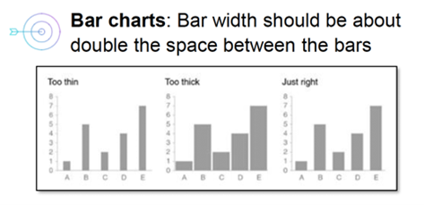
Step 5: Be Mindful of Size, Order, and Quantity
As you think about layout, design, and decluttering and all the things you leave out, you should also spend time thinking about being intentional of what you put in the dashboard.
Step 6: Avoid These Design Pitfalls
As you think about how your data visualization dashboard will tell a story, avoid elements that could potentially visually skew data. There are some graph types and design techniques that detract from visualizations. If you can, avoid using pie charts, donut charts, 3D designs, and secondary y-axes.
Remember, data visualization dashboards should point users to insights, not just access to their data. Download the “6 Tips To Create Powerful Data Visualizations” e-Book to learn more.